Branding
Brand identity
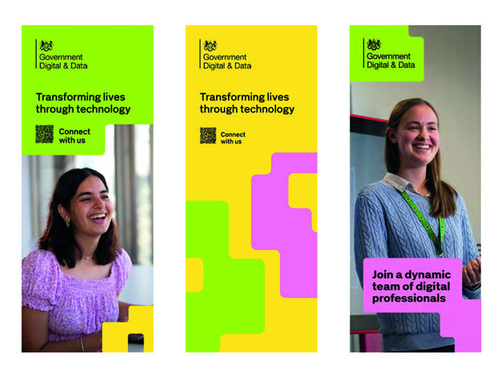
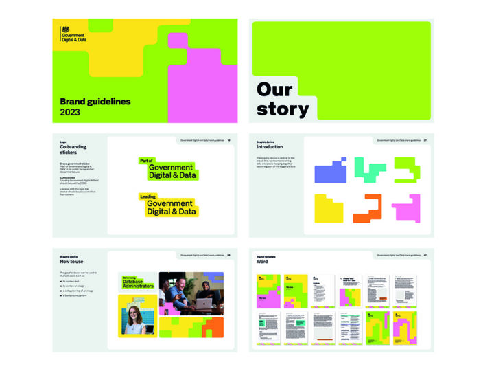
Government Digital and Data
The challenge
The Digital, Data and Technology (DDaT) Profession asked us for new brand to provide a respected and unified identity for internal staff, and to position government as a tech-sector employer of choice for external candidates. The requirements of these two audiences varied significantly, so our brand had to resonate with both. To attract top talent from the private sector, we knew we needed to counter negative perceptions of the Civil Service and showcase the unique benefits of DDaT’s work.
Our solution
After gathering insight from stakeholder interviews, desk research and landscape audits, we developed three distinct creative routes and tested them with Civil Service and private sector professionals. We worked closely with the client to refine the chosen route, ensuring it achieved the right balance between professional and dynamic to appeal to both audiences. We renamed the profession to Government Digital and Data, producing an extensive suite of brand assets and guidelines to support recruitment and retention communications.
Brand identity
Operational Delivery Profession (ODP)
The challenge
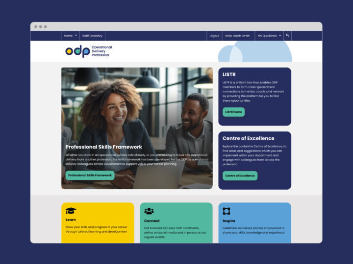
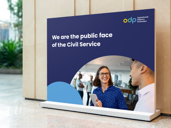
The Operational Delivery Profession (ODP) supports civil servants who deliver essential frontline services. Their branding no longer reflected their mission to help civil servants learn, connect and inspire through training and career development. The existing design was viewed as outdated and inaccessible, with colours that were difficult to use and lacked sophistication. ODP needed a new logo and visual identity that felt modern, professional and inclusive, while incorporating their core pillars.
Our solution
We developed a fresh brand identity centred on the ODP acronym to simplify the long name and retain familiarity. The lowercase logo featured circular counters representing people’s heads, symbolising ODP’s focus on the ‘public face’ of the Civil Service, while speech bubble shapes reflected communication and connection. A colour palette of yellow, green and blue aligned with the pillars of Learn, Connect and Inspire, ensuring accessibility and a cohesive design.
Brand identity
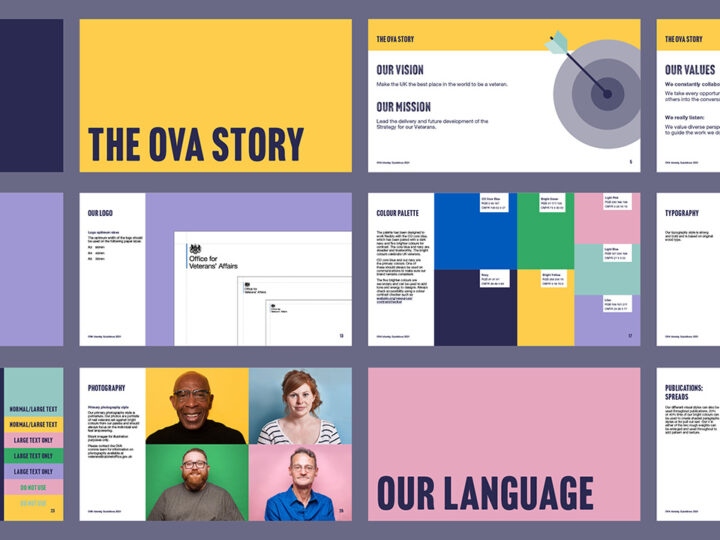
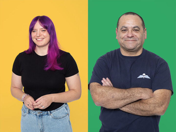
Office for Veterans’ Affairs
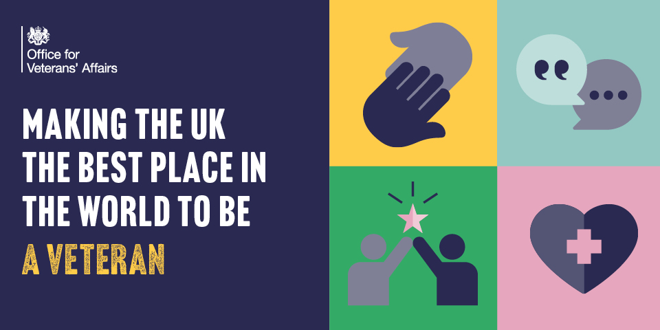
The challenge
The Office for Veterans’ Affairs was set up in 2019 and aims to make the UK the best place in the world to be a veteran. We were asked to create a brand identity to help unlock their ambition and build brand recognition. The brand needed to resonate with their staff and partners as well as the veterans they support.
Our solution
We created a vibrant and emotive brand that smashes stereotypes and recognises the unique contribution veterans make to society. Photography and bright block colours give the brand a modern and engaging look, while simple icons, textured typography and a unified tone of voice all bring a human touch.
Rebrand
Emergency Services Network
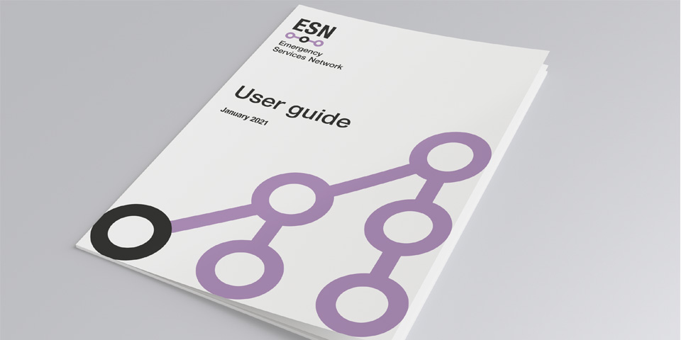
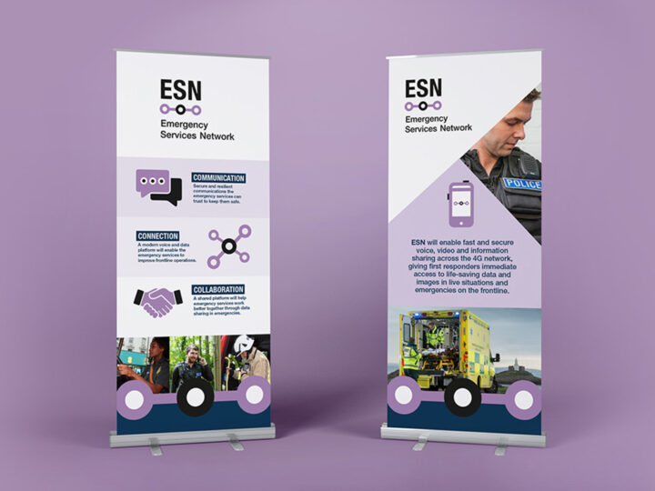
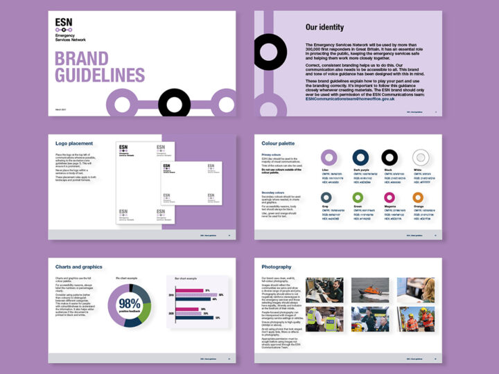
The challenge
The Emergency Services Network is a new critical communications system that will be used by over 300,000 emergency service workers in Great Britain, including ambulance and fire and rescue teams. We were asked to create a simple, digital-focused brand to ensure the system is easy and intuitive to use in high-pressure situations.
Our solution
The simple brand focuses on the Emergency Services Network’s role in keeping workers connected. Straight lines and rounded shapes join up to represent direct communication and teamwork. This uncluttered approach means that users can navigate and find information quickly, supporting their life-saving work.
Great work starts with a conversation
Get in touch